Best Picture:
BOYHOOD
Birdman
The Imitation Game
The Theory of Everything
American Sniper
The Grand Budapest Hotel
Selma
Whiplash
Best Director:
RICHARD LINKLATER, BOYHOOD
Wes Anderson, The Grand Budapest Hotel
Alejandro González Iñárritu, Birdman
Bennett Miller, Foxcatcher
Morten Tyldum, The Imitation Game
Best Actor:
MICHAEL KEATON, BIRDMAN
Benedict Cumberbatch, The Imitation Game
Eddie Redmayne, The Theory of Everything
Steve Carell, Foxcatcher
Bradley Cooper, American Sniper
Best Actress:
JULIANNE MOORE, STILL ALICE
Rosamund Pike, Gone Girl
Marian Cotillard, Two Days, One Night
Reese Witherspoon, Wild
Felicity Jones, The Theory of Everything
Best Supporting Actor:
Robert Duvall, The Judge
Ethan Hawke, Boyhood
Edward Norton, Birdman
Mark Ruffalo, Foxcatcher
J.K. SIMMONS, WHIPLASH
Best Supporting Actress:
PATRICIA ARQUETTE, BOYHOOD
Laura Dern, Wild
Keira Knightley, The Imitation Game
Emma Stone, Birdman
Meryl Streep, Into The Woods
Adapted Screenplay:
Jason Hall, American Sniper
GRAHAM MOORE, THE IMITATION GAME
Paul Thomas Anderson, Inherent Vice
Anthony McCarten, The Theory of Everything
Damien Chazelle, Whiplash
Original Screenplay:
Alejandro G. Iñárritu, Nicolás Giacobone, Alexander Dinelaris Jr. and Armando Bo, Birdman
Richard Linklater, Boyhood
E. Max Frye and Dan Futterman, Foxcatcher
WES ANDERSON AND HUGO GUINESS, THE GRAND BUDAPEST HOTEL
Dan Gilroy, Nightcrawler
Best Cinematography:
BIRDMAN, EMMANUEL LUBEZKI
The Grand Budapest Hotel, Robert Yeoman
Ida, Lukasz Zal and Ryszard Lenczewski
Mr. Turner, Dick Pope
Unbroken, Roger Deakins
Costume Design:
THE GRAND BUDAPEST HOTEL, MILENA CANONERO
Inherent Vice, Mark Bridges
Into the Woods, Colleen Atwood
Maleficent, Anna B. Sheppard and Jane Clive
Mr. Turner, Jacqueline Durran
Best Production Design:
THE GRAND BUDAPEST HOTEL, ADAM STOCKHAUSEN (PRODUCTION DESIGN) AND ANNA PINNOCK (SET DECORATION)
The Imitation Game, Maria Djurkovic (production design) and Tatiana Macdonald (set decoration)
Interstellar, Nathan Crowley (production design) and Gary Fettis (set decoration)
Into the Woods, Dennis Gassner (production design) and Anna Pinnock (set decoration)
Mr. Turner, Suzie Davies (production design) and Charlotte Watts (set decoration)
Best Film Editing:
American Sniper, Joel Cox and Gary D. Roach
BOYHOOD, SANDRA ADAIR
The Grand Budapest Hotel, Barney Pilling
The Imitation Game, William Goldenberg
Whiplash, Tom Cross
Best Original Score:
The Grand Budapest Hotel, Alexandre Desplat
The Imitation Game, Alexandre Desplat
Interstellar, Hans Zimmer
Mr. Turner, Gary Yershon
The Theory of Everything, Jóhann Jóhannsson
Best Original Song:
“Everything Is Awesome” in “The Lego Movie”
"GLORY" IN "SELMA"
“Grateful” in “Beyond the Lights”
“I’m Not Gonna Miss You” in “Glen Campbell … I’ll Be Me”
“Lost Stars” in “Begin Again”
Best Documentary Feature:
CITIZENFOUR
Finding Vivian Maier
Last Days in Vietnam
The Salt of the Earth
Virunga
Best Documentary Short:
CRISIS HOTLINE: VETERANS PRESS 1
Joanna
Our Curse
The Reaper (La Parka)
White Earth
Best Animated Feature:
Big Hero 6
The Boxtrolls
HOW TO TRAIN YOUR DRAGON 2
Song of the Sea
The Tale of the Princess Kaguya
Best Foreign Film:
Ida (Poland)
Leviathan (Russia)
Tangerines (Estonia)
Timbuktu (Mauritania)
WILID TALEs (ARGENTINA)
Best Visual Effects:
Captain America: The Winter Soldier, Dan DeLeeuw, Russell Earl, Bryan Grill and Dan Sudick
Dawn of the Planet of the Apes, Joe Letteri, Dan Lemmon, Daniel Barrett and Erik Winquist
Guardians of the Galaxy,” Stephane Ceretti, Nicolas Aithadi, Jonathan Fawkner and Paul Corbould
Interstellar, PAUL FRANKLIN, ANDREW LOCKLEY, IAN HUNTER AND SCOTT FISCHER
X-Men: Days of Future Past, Richard Stammers, Lou Pecora, Tim Crosbie and Cameron Waldbauer
Best Sound Editing:
AMERICAN SNIPER, ALAN ROBERT MURRAY AND BUB ASMAN
Birdman, Martín Hernández and Aaron Glascock
The Hobbit: The Battle of the Five Armies, Brent Burge and Jason Canovas
Interstellar, Richard King
Unbroken, Becky Sullivan and Andrew DeCristofaro
Best Sound Mixing:
Ameircan Sniper, John Reitz, Gregg Rudloff and Walt Martin
Birdman, Jon Taylor, Frank A. Montaño and Thomas Varga
Interstellar, Gary A. Rizzo, Gregg Landaker and Mark Weingarten
Unbroken, Jon Taylor, Frank A. Montaño and David Lee
WHIPLASH, CRAID MANN, BEN WILKINS AND THOMAS CURLEY
Best Makeup and Hairstyling:
Foxcatcher, Bill Corso and Dennis Liddiard
The Grand Budapest Hotel, Frances Hannon and Mark Coulier
GUARDIANS OF THE GALAXY, ELIZABETH YIANNI-GEORGIEU AND DAVID WHITE
Live Action Short Film:
Aya
Boogaloo and Graham
Butter Lamp (La Lampe au Beurre de Yak)
Parvaneh
THE PHONE CALL
Animated Short Film:
The Bigger Picture
The Dam Keeper
FEAST
Me and My Moulton
A Single Life

Thanks for sharing. I love stuff like this.
Reblogged this on victorsmoviereviews and commented:
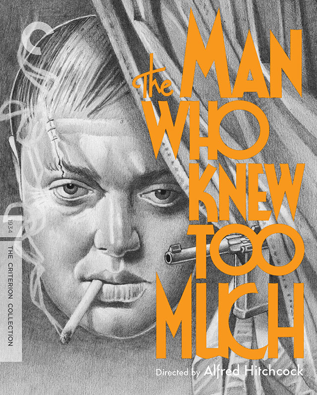
Small sample of the creative process.
I feel exactly the same about buying Criterions, it is like buying a work of art. Here in Australia they are super expensive, probably even moreso than in America and other places. But despite that, I feel like I get the most value out of those purchases compared to standard DVD/Blu-rays. Mainly cause I watch and re-watch, and trawl through the extras which I rarely do for standard purchases.
Great article by the way.
I feel the same way about buying Criterions…but I usually watch all the special features too, so I can justify them that way too. Or something.